
The Role of Colour in Interior Design: An Emotional Journey
When it comes to interior design, many people perceive colour as a mere finishing touch, applied after the primary elements of a room have been established. However, for me, colour is the starting point of any design journey. My approach begins with a fundamental question: how do I want the space to support my emotional, behavioural, and practical needs? From this foundation, I carefully select a colour palette that resonates with my intentions.
Learn more: Chiropractor Palm Beach Gardens Florida Expert Care
In my own residence, each colour serves a specific purpose, functioning as a tool to shape the behaviours and feelings I wish to cultivate within the space. This philosophy also extends to my work with clients; I start by understanding their desired use of the space and the positive behaviours they wish to encourage. From there, I curate a unique colour palette that reflects their aspirations. My approach is not about conforming to trends or playing it safe; it’s about intentionality and the psychology of colour in design.
Principles of Colour Psychology in Interior Design
Over the years, I have established several important principles regarding the use of colour in home decoration. Here are seven guidelines that I adhere to, ensuring that colour choices are supportive rather than disruptive.
1. Avoid Following Trends That Misalign with Personal Needs
While colour trends can provide inspiration, I never select a colour simply because it’s fashionable. A choice must align with my lifestyle and the atmosphere I wish to create. Trends can sometimes look appealing on the surface but may feel out of place in reality. Personal alignment with colour choices is indispensable in creating a home that truly reflects who I am.
2. Treat Each Room as Unique
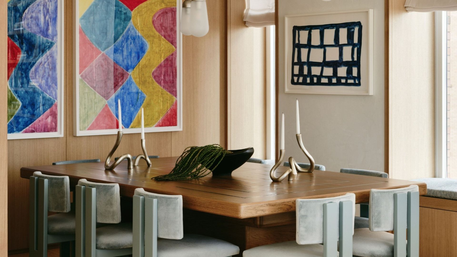
A common design practice is to apply the same colour scheme throughout the home, often referred to as a ‘red thread’. While this may work for some, I prefer to tailor my colour choices based on the intended function of each room. For instance, the calming colours in my bedroom differ significantly from the energising hues in my home office. Each space serves a distinct purpose, and my colour selections reflect that diversity.
3. Resist the Temptation to Mimic Others
It’s tempting to replicate a stunning colour scheme seen in a magazine or on social media. However, selecting colours based on someone else’s life can lead to a lack of authenticity in your own home. What works for one individual may not resonate with another, and it’s crucial to choose colours that align with one’s own personality and lifestyle.
4. Don’t Assume Your Favourite Colour Is the Best Choice
While it may seem logical to incorporate our favourite colours into our homes, I have learned that what I adore in one context may not serve me well in another. For instance, my preferred shade of calendula marigold orange is vibrant and lively, but too much of it can be overwhelming in my living space. It’s essential to assess how a colour will support the room’s purpose and the intended emotional response.
5. Focus on Intent Rather than Aesthetic
Many individuals start their design process by collecting visual inspiration, such as Pinterest boards or paint charts. However, I begin with intention—the desired emotional and behavioural impact of the space. Questions like whether I want to feel energised or nurtured guide my colour choices, often leading me to selections that are far removed from current trends.
6. Consider Colour Relationships
Choosing a colour in isolation can be misleading, as colours do not exist independently in a room. Each hue interacts with surrounding elements—walls, flooring, furniture, and materials—and together they convey a different emotional message. Therefore, I carefully examine how colours work together, assessing their collective impact on the behaviours I wish to foster.
7. Acknowledge the Influence of Natural Light
Lighting plays a critical role in how we perceive colour. I never finalise colour selections without considering the natural and artificial light in a room. A colour may appear soft and inviting in the morning sun but shift to a colder tone later in the day. Testing colours at different times allows me to understand how light interacts with them, ensuring that the chosen palette aligns with the room’s intended atmosphere.
Frequently Asked Questions
What Are the Most Challenging Colours in Colour Psychology?
In colour psychology, it’s essential to recognise that no colour is inherently negative or positive. Each hue has the potential to support or disrupt, depending on its application. However, I tend to avoid harsh whites, which can feel sterile, and flat greys, often perceived as draining or lifeless. The key is selecting colours that bolster emotional well-being and promote positive behaviours in the space.
For those intrigued by exploring the psychological aspects of colour further, I recommend delving into literature that discusses its transformative power. Intentional colour choices can elevate a home from merely being aesthetically pleasing to a nurturing environment that actively supports how we wish to live and feel. This is a commitment I uphold for myself and my clients, ensuring that every design decision is meaningful and personally aligned.